
Donna Taylor, Colour Design Manager at Johnstone’s Trade, discusses that colour has shifted well beyond decoration. For architects and designers, it is a strategic component of the built environment, shaping how people experience space, supporting wellbeing, and helping clients meet evolving expectations around inclusivity and sustainability. The colour schemes expected to trend in 2026 are true expressions of this shift, offering a framework that helps specifiers design with purpose and deliver on these growing demands.
A year defined by nuance and refinement
There will be a move away from bold, statement-making colours toward rich, nuanced palettes. Subtle variations in tone, texture, and saturation allow designers to create balanced spaces that feel calming and restorative, while avoiding monotony.
How colour interacts with surface, materiality and light is central to this shift. A shade that feels warm and enveloping on a textured wall can appear sharper on a smooth finish, and the difference between natural daylight and LED illumination can transform a scheme entirely. Designers are placing greater emphasis on testing palettes early, understanding how they evolve throughout the day, in different light, and across various materials.
The trending colour palettes of 2026
Colour can be organised into design palettes that help specifiers make purposeful choices and aid in the design narrative they’re looking to achieve. These palettes reflect common approaches to how colour supports human experience in different settings. Three palettes we at Johnstone’s Trade predict will dominate in 2026 are:
- Expressive: The Expressive palette uses vibrant shades to introduce energy and movement – featuring bold blues, statement oranges, deep reds and bright yellow hues. They are effective in collaborative workplaces, hospitality venues or education environments where pace and creativity are central. Pairing vibrant tones with clean architectural lines or neutral backdrops helps maintain balance while ensuring the environment remains balanced yet energetic.
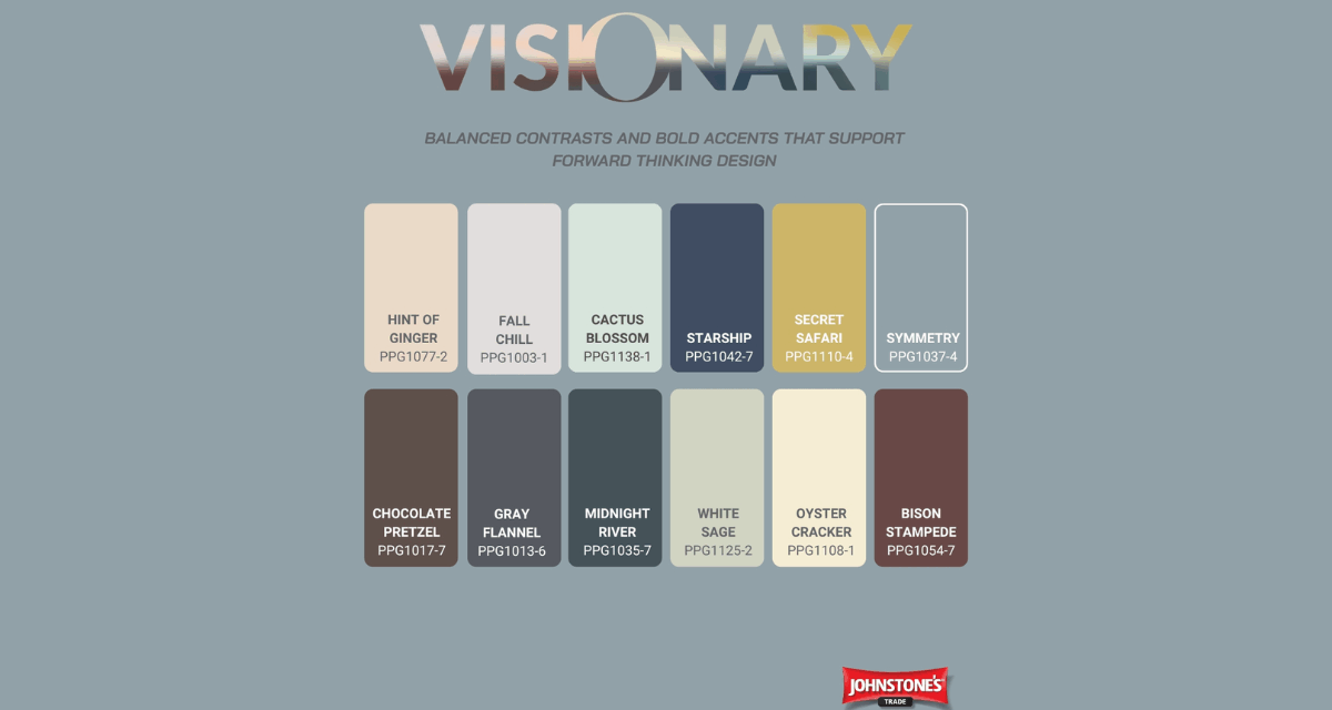
- Visionary: The Visionary palette looks forward, combining softened futuristic tones like muted neutrals, grounded browns, and blues with subtle metallics and tactile finishes. This approach is expected in commercial interiors and mixed‑use spaces where adaptability is important. The colours respond to changing light, making them reliable in areas with both natural and artificial lighting.
- Authentic: The Authentic palette draws on retro references, earthy warmth and deep connections to nature. Autumnal tones, chalky browns and yellow‑greens combine well with textured tiles, warm woods and soft matt finishes. This narrative will be particularly relevant for residential projects, hospitality spaces, and wellbeing‑focused environments where tactility and familiarity matter.
By framing colour choices through these narratives, specifiers can align palettes with design intent and communicate their rationale clearly to clients.
The 60-30-10 rule
To achieve the ultimate balance when applying these trends, the 60-30-10 rule can be useful, whereby each colour takes up a particular proportion of the space:
- 60%: the dominant colour, often a neutral or grounding shade that sets the tone for the rest of the design
- 30%: the secondary colour, used for definition or depth and boosting visual interest
- 10%: the accent colour, used sparingly to add character or highlight details. Often a more vibrant, bolder shade
This approach creates harmony without losing dynamism. For example, a scheme based on the Authentic palette might combine a warm neutral as the 60%, a wood-inspired mid-tone as the 30%, and a saturated earthy accent for the 10%. Expressive can be handled in the same way, using bolder accents that lift a space without overwhelming it.
Colour psychology and its role in sector-specific design
Understanding how colour influences behaviour makes colour trends far more actionable. Which colours to specify depends entirely on the type of project, the objective of the space, the needs of those who will experience it, and how you want them to feel. For instance:
- Greens and yellow-greens are shown to support calm, reduce stress and improve focus. Ideal for healthcare, education, or mixed-use spaces where comfort and clarity are essential.
- Warm neutrals create familiarity and ease. They perform well in residential and hospitality settings.
- Soft blues are typically associated with clarity and concentration, making them suitable for inclusive workspaces or learning environments.
- Richer tones add confidence and warmth, helpful in reception areas or zones where wayfinding is a crucial aspect for functionality.
Applying psychology in this way helps designers tailor schemes around how people will use the space, not just how the space will look.
Secret Safari: the 2026 Colour of the Year
Secret Safari, Johnstone’s Trade Colour of the Year 2026, is a strong example of these principles at work. Its yellow-green tone conveys a sense of calm vitality and reassurance, reflecting the wider move towards restorative, nature-inspired design.
It demonstrates how one tone can work across sectors when used with intention. It pairs naturally with woods and warm neutrals and shifts subtly with light. This makes it equally effective across healthcare (calming), education (uplifting), hospitality (freshness) and residential design (warm natural character).
Its adaptability embodies the move towards palettes that can flex as the requirements of a space do. When injected into the 60-30-10 rule, Secret Safari can anchor a wide range of schemes without feeling prescriptive.
Designing with intent
In 2026, colour is a tool for purpose-driven design that supports and enriches the human experience. The palettes that will define the year help specifiers to design with clarity and confidence, and deliver subtle, layered, cohesive schemes that meet a variety of briefs. It’s about bringing to life spaces that are not only visually compelling but also meaningful, enduring, and tailored to the needs of the people who inhabit them. That level of purpose is what will define the most successful interiors of 2026.